vrunda tambe
recent work
resume
MUBI - SmartTV App Redesign
UX Design, UI design, Ix design
Overview
Mubi is a streaming service that offers a monthly rotating line up of niche, independent films. Marketed towards cinema fans, it has several unique features that differentiates it from its contemporaries. It is available as an app for desktop, mobile and the web.

I found being a Mubi user frustrating because the app lacked several basic functionalities. I decided to put my design skills to the test and redesign the app in order to improve its user experience.

Business Case for the redesign:

• Increase conversion rates from trial users to recurring subscribers
• Increase user referrals
• Grow revenue and market share
• Compete with industry giants like Netflix, HBO etc.
View Prototype
* Best interacted with a game controller
MUBI's existing smartTV UI
UI after redesign
Identifying the problem
I started by interacting with the existing UI to fully familiarize myself with the interface and to understand all potential user flows. I was able to establish at least four common use cases, but before diving deeper into that I wanted to conduct some user and design research.
User Research
I was keen to talk with some users to understand if they shared this opinion and what the pain-points were. What were they doing, thinking and feeling while using this app?

The user interviews revealed four common themes on their source of frustration.
01 Unable to search for content
“Am I expected to manually scroll through hundreds of title to find the one I want to watch?”
02 Unpredictable Navigation
“I would like the freely explore the app without getting kicked out each time I try to back navigate.”
03 Save content for later
“Being able to save films to watch later would be a basic functionality I’d think...”
User Journey
To futher empathize with the user base, I created a user persona and an example user journey.
Design Research
HMW
After breaking down the user journey into key steps, I used the insights from my design research to ask myself HMW questions. This allowed me to explore design opportunities and gather inspiration.
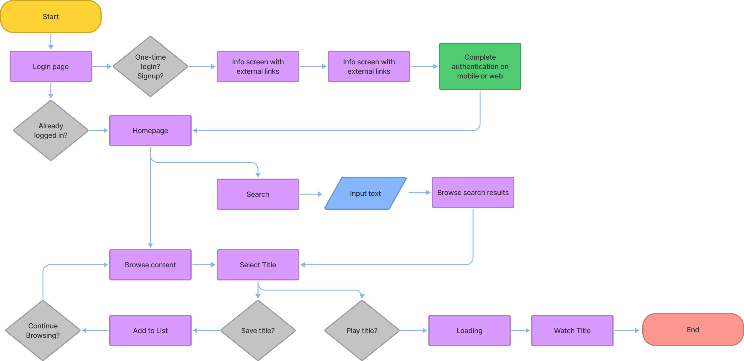
User Flows
With a better understanding of the user pain-points, their needs as well as the overarching TV design philosophy, I asked myself -  what is the main point of this app?

If the primary goal for a user is to get to watching a movie of their choice, how can they achieve this goal in the fewest steps?

With this in mind, I analysed the app’s info architecture at a granular level, and also expanded the primary use case to account for any smaller use cases that might occur while the user was trying to get to their end goal.
Design Exploration
I tested concepts and design exploration through lo-fidelity wireframes. The main goal at this stage was to create a visual framework for each scenario highlighted above. I tested these wireframes with users and iterated the designs accordingly.
Workflow Challenges
01 Design Trade-offs
I was challenged with the scope of the project and the initial time frame. In order to stay on track, I decided to refocus my efforts on only the most critical missing functionality i.e. building out hi-fi prototypes for the search feature, redesigning navigation patterns and adding a save feature.
02 Technical constraints
There are a few varieties of standard remote controls users use depending on their TV's compatibility. I decided to simplify the scope of this project and create a prototype compatible with a Xbox remote controller.
Iterating and validating assumptions
01 Safe Zones & Margins
Users found the first round of designs to be out of scale. I resized the margin areas and adjusted the content card sizes to use the screen’s real estate more efficiently
Safe zones and margins before user testing
Safe zones and margins after user testing
02 Focus States
Focus states are common navigational features used when designing for TV. I added preset focus states for all main screens in order to anchor the user and provide a clear starting point for subsequent user flows.
Screen design without a preset focus state
Screen design a preset focus state
03 Navigation Menu
I added extra emphasis on the selected states in the navigation menu to make the selection more distinct and easily recognizable.
Selection state before user testing
Selection state after user testing
Hi-fidelity Prototypes
View Figma Prototype
01 Safe Zones & Margins
The user is greeted with a bold, visual and logically categorized home page. A preset focus states guides their starting point and horizontal scrolling feels more natural as well as fluid.
02 Searching for content
Text entry is minimized by listing popular or recent searches. Search results are presented in an easy to navigate grid layout.
03 Saving content for later
The user experience is enhanced and expanded by allowing the user to save content for later. A subtle animation indicates when the action is complete, keeping the user updated at all times.
Reflections and Learnings
Designing for TV allowed me to learn, think and visualize differently than I was used to. Clear user tasks and functionality that needed to be integrated helped provide structure to the project

If I had more time, I would conduct additional rounds of user testing, improve ‘My List’ feature, expand on user-curated lists and add a voice search functionality
Next
GHS mobile app design →